Casual Inference Data analysis and other apocrypha
Flexible prediction intervals: Quantile Regression in Python
Most useful forecasts include a range of likely outcomes
It’s generally good to try and guess what the future will look like, so we can plan accordingly. How much will our new inventory cost? How many users will show up tomorrow? How much raw material will I need to buy? The first instinct we have is usual to look at historical averages; we know the average price of widgets, the average number of users, etc. If we’re feeling extra fancy, we might build a model, like a linear regression, but this is also an average; a conditional average based on some covariates. Most out-of-the-box machine learning models are the same, giving us a prediction that is correct on average.
However, answering these questions with a single number, like an average, is a little dangerous. The actual cost will usually not be exactly the average; it will be somewhat higher or lower. How much higher? How much lower? If we could answer this question with a range of values, we could prepare appropriately for the worst and best case scenarios. It’s good to know our resource requirements for the average case; it’s better to also know the worst case (even if we don’t expect the worst to actually happen, if total catastrophe is plausible it will change our plans).
As is so often the case, it’s useful to consider a specific example. Let’s imagine a seasonal product; to pick one totally at random, imagine the inventory planning of a luxury sunglasses brand for cats. Purrberry needs to make summer sales projections for inventory allocation across its various brick-and-mortar locations where it’s sales happen.
You go to your data warehouse, and pull last year’s data on each location’s pre-summer sales (X-axis) and summer sales (Y-axis):
from matplotlib import pyplot as plt
import seaborn as sns

plt.scatter(df['off_season_revenue'], df['on_season_revenue'])
plt.xlabel('Off season revenue at location')
plt.ylabel('On season revenue at location')
plt.title('Comparison between on and off season revenue at store locations')
plt.show()
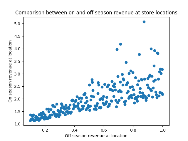
We can read off a few things here straight away:
- A location with high off-season sales will also have high summer sales; X and Y are positively correlated.
- The outcomes are more uncertain for the stores with the highest off-season sales; the variance of Y increases with X.
- On the high end, outlier results are more likely to be extra high sales numbers instead of extra low; the noise is asymmetric, and positively skewed.
After this first peek at the data, you might reach for that old standby, Linear Regression.
Our usual tool, OLS, doesn’t always handle this well
Regression afficionados will recall that our trusty OLS model allows us to compute prediction intervals, so we’ll try that first.
Recall that the OLS model is
$y ~ \alpha + \beta x + N(0, \sigma)$
Where $\alpha$ is the intercept, $\beta$ is the slope, and $\sigma$ is the standard deviation of the residual distribution. Under this model, we expect that observations of $y$ are normally distributed around $\alpha + \beta x$, with a standard deviation of $\sigma$. We estimate $\alpha$ and $\beta$ the usual way, and look at the observed residual variance to estimate $\sigma$, and we can use the familiar properties of the normal distribution to create prediction intervals.
from statsmodels.api import formula as smf

ols_model = smf.ols('on_season_revenue ~ off_season_revenue', df).fit()
predictions = ols_model.predict(df)
resid_sd = np.std(ols_model.resid)

high, low = predictions + 1.645 * resid_sd, predictions - 1.645 * resid_sd

plt.scatter(df['off_season_revenue'], df['on_season_revenue'])
plt.plot(df['off_season_revenue'], high, label='OLS 90% high PI')
plt.plot(df['off_season_revenue'], predictions, label='OLS prediction')
plt.plot(df['off_season_revenue'], low, label='OLS 90% low PI')
plt.legend()
plt.xlabel('Off season revenue at location')
plt.ylabel('On season revenue at location')
plt.title('OLS prediction intervals')
plt.show()
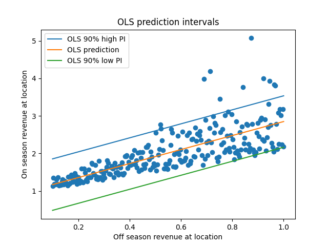
Hm. Well, this isn’t terrible - it looks like the 90% prediction intervals do contain the majority of observations. However, it also looks pretty suspect; on the left side of the plot the PIs seem too broad, and on the right side they seem a little too narrow.
This is because the PIs are the same width everywhere, since we assumed that the variance of the residuals is the same everywhere. But from this plot, we can see that’s not true; the variance increases as we increase X. These two situations (constant vs non-constant variance) have the totally outrageous names homoskedasticity and heteroskedasticity. OLS assumes homoskedasticity, but we actually have heteroskedasticity. If we want to make predictions that match the data we see, and OLS model won’t quite cut it.
NB: A choice sometimes recommended in a situation like this is to perform a log transformation, but we’ve seen before that logarithms aren’t a panacea when it comes to heteroskedasticity, so we’ll skip that one.
The idea: create prediction intervals based on the conditional quantiles
We really want to answer a question like: “For all stores with $x$ in pre-summer sales, where will (say) 90% of the summer sales per store be?”. We want to know how the bounds of the distribution, the highest and lowest plausible observations, change with the pre-summer sales numbers. If we weren’t considering an input like the off-season sales, we might look at the 5% and 95% quantiles of the data to answer that question.
We want to know what the quantiles of the distribution will be if we condition on $x$, so our model will produce the conditional quantiles given the off-season sales. This is analogous to the conditional mean, which is what OLS (and many machine learning models) give us. The conditional mean is $\mathbb{E}[y \mid x]$, or the expected value of $y$ given $x$. We’ll represent the conditional median, or conditional 50th quantile, as $Q_{50}[y \mid x]$. Similarly, we’ll call the conditional 5th percentile $Q_{5}[y \mid x]$, and the conditional 95th percentile will be $Q_{95}[y \mid x]$.
OLS works by finding the coefficients that minimize the sum of the squared loss function. Quantile regression can be framed in a similar way, where the loss function is changed to something else. For the median model, the minimization happening is LAD, a relative of OLS. For a model which computes arbitrary quantiles, we mininimize the whimsically named pinball loss function. You can look at this section of the Wikipedia page to learn about the minimization problem happening under the hood.
Quantile regression in action
Fitting the model
As usual, we’ll let our favorite Python library do the hard work. We’ll build our quantile regression models using the statsmodels implementation. The interface is similar to the OLS model in statsmodels, or to the R linear model notation. We’ll fit three models: one for the 95th quantile, one for the median, and one for the 5th quantile.
high_model = smf.quantreg('on_season_revenue ~ off_season_revenue', df).fit(q=.95)
mid_model = smf.quantreg('on_season_revenue ~ off_season_revenue', df).fit(q=.5)
low_model = smf.quantreg('on_season_revenue ~ off_season_revenue', df).fit(q=.05)

plt.scatter(df['off_season_revenue'], df['on_season_revenue'])
plt.plot(df['off_season_revenue'], high_model.predict(df), label='95% Quantile')
plt.plot(df['off_season_revenue'], mid_model.predict(df), label='50% Quantile (Median)')
plt.plot(df['off_season_revenue'], low_model.predict(df), label='5% Quantile')
plt.legend()
plt.xlabel('Off season revenue at location')
plt.ylabel('On season revenue at location')
plt.title('Quantile Regression prediction intervals')
plt.show()
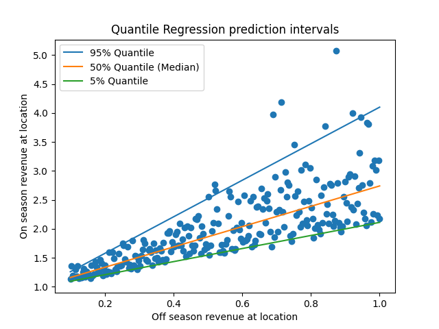
The 90% prediction intervals given by these models (the range between the green and blue lines) look like a much better fit than those given by the OLS model. On the left side of the X-axis, the interval is appropriately narrow, and then widens as the X-axis increases. This change in width indicates that our model is heteroskedastic.
It also looks like noise around the median is asymmetric; the distance from the upper bound to the median looks larger than the distance from the lower bound to the median. We could see this in the model directly by looking at the slopes of each line, and seeing that $\mid \beta_{95} - \beta_{50} \mid \geq \mid \beta_{50} - \beta_{5} \mid$.
Checking the model
Being careful consumers of models, we are sure to check the model’s performance to see if there are any surprises.
First, we can look at the prediction quality in-sample. We’ll compute the coverage of the model’s predictions. Coverage is the percentage of data points which fall into the predicted range. Our model was supposed to have 90% coverage - did it actually?
from scipy.stats import sem
covered = (df['on_season_revenue'] >= low_model.predict(df)) & (df['on_season_revenue'] <= high_model.predict(df))
print('In-sample coverage rate: ', np.average(covered))
print('Coverage SE: ', sem(covered))
In-sample coverage rate:  0.896
Coverage SE:  0.019345100974843932
The coverage is within one standard error of 90%. Nice!
There’s no need to limit ourselves to looking in-sample and we probably shouldn’t. We could use the coverage metric during cross-validation, ensuring that the out-of-sample coverage was similarly good.
When we do OLS regression, we often plot the predictor against the error to understand whether the linear specification was reasonable. We can do the same here by plotting our predictor against the coverage. This plot shows the coverage and a CI for each quartile.
sns.regplot(df['off_season_revenue'], covered, x_bins=4)
plt.axhline(.9, linestyle='dotted', color='black')
plt.title('Coverage by revenue group')
plt.xlabel('Off season revenue at location')
plt.ylabel('Coverage')
plt.show()
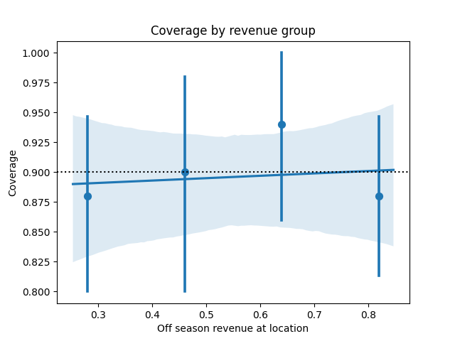
All the CIs contain 90% with no clear trend, so the linear specification seems reasonable. We could make the same plot by decile, or even percentile as well to get a more careful read.
What if that last plot had looked different? If the coverage veers off the the target value, we could have considered introducing nonlinearities to the model, such as adding splines.
Some other perspectives on quantile regression and prediction intervals
This is just one usage of quantile regression. QR models can also be used for multivariable analysis of distributional impact, providing very rich summaries of how our covariates are correlated with change in the shape of the output distribution.
We also could have thought about prediction intervals differently. If we believed that the noise was heteroskedastic but still symmetric (or perhaps even normally distributed), we could have used an OLS-based procedure model how the residual variance changed with the covariate. For a great summary of this, see section 10.3 of Shalizi’s data analysis book.
Appendix: How the data was generated
The feline fashion visionaries at Purrberry are, regrettably, entirely fictional for the time being. The data from this example was generated using the below code, which creates skew normal distributed noise:
import numpy as np
from scipy.stats import skewnorm
import pandas as pd

n = 250
x = np.linspace(.1, 1, n)
gen = skewnorm(np.arange(len(x))+.01, scale=x)
gen.random_state = np.random.Generator(np.random.PCG64(abs(hash('predictions'))))
y = 1 + x + gen.rvs()

df = pd.DataFrame({'off_season_revenue': x, 'on_season_revenue': y})