Casual Inference Data analysis and other apocrypha
When do we log transform the response variable? Model assumptions, multiplicative combinations and log-linear models

Sometimes, analysts will perform a log transformation of the outcome variable to “make the residuals look normal”. In some cases this is just papering over other issues, but sometimes this kind of transformation genuinely improves the inference or produces a better fitting model. In what cases does this happen? Why does the log transformation work the way it does? How do we interpret the transformed model?
Banner from XKCD 451.
One common reason: Because log-transformed data fits the model assumptions better than any other transformation
A commonly cited justification for log transforming the response variable is that the OLS assumptions are being violated, and the transformation will remedy this. These arguments often go something like:
- My residuals are non-normal because they are skewed or have outliers; a log transform makes them more symmetric.
- My residuals show evidence of heteroskedasticity; log transforming the response makes the residual variance seem constant.
- My dependent variable is constrained to be positive, but in an OLS model the outcome variable can be negative.
A log transformation of the response variable may sometimes resolve these issues, and is worth considering. However, each of these problems has other potential solutions:
- Asymmetric residuals could be resolved by a different non-linear transformation of the outcome; the log transform is not special. A square root, for example, may have the same effect. You might also consider a model with an asymmetric or heavy-tailed residual distribution.
- Heteroskedasticity can be accounted for by making the non-constant variance part of your model. In the linear model framework, WLS is a common solution.
- A dependent variable which is definitionally positive can be accounted for with a GLM other than OLS, like a Negative-binomial model or Gamma model.
Variance-stabilizing transformations like the Box-Cox transformation are also popular methods for dealing with these problems, and are more complex than simply taking a log.
The point here is not that a log transformation can’t solve these problems - it sometimes can! Rather, the point is that it will not always solve these problems. It’s worth looking at an example where the OLS assumptions are violated but the log transform doesn’t help.
Log transformations do not automatically fix model assumption problems
It’s worth walking through an example where a logarithm transform of the response doesn’t work, in order to get some intuition as to why.
Let’s look at a dataset on which we apply a simple regression model. The dataset has one binary dependent variable, and one continuous outcome variable. The true distribution of the data is:
\[y | x = 0 \sim N(10, 2)\] \[y | x = 1 \sim N(20, 1)\]That is, as $x$ increases, so does the expected value of $y$. And as $x$ increases, the variance of $y$ decreases, a classically heteroskedastic situation. Let’s construct a sample from this dataset, and then fit a linear model to it. We’ll plot the residuals against $x$, a standard diagnostic for heteroskedasticity.
*You can find the import statements for the code at the bottom of the post.
df = pd.DataFrame({'x': [0] * 100 + [1] * 100,
                   'y': np.random.normal([10] * 100 + [20] * 100, [2]*100 + [1]*100)})

model = smf.ols('y ~ x', df)
fit = model.fit()

plt.scatter(df['x'], df['y'] - fit.predict(df))
plt.show()
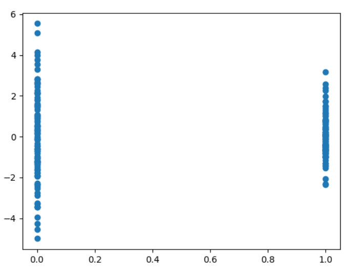
The result is what we expect - the variance of the residuals changes with $x$. As I mentioned, this is sometimes a case in which a log transform is used. Let’s try one out and see what happens with this model’s residuals:
log_model = smf.ols('np.log(y) ~ x', df)
log_fit = log_model.fit()

plt.scatter(df['x'], log_fit.resid)
plt.show()
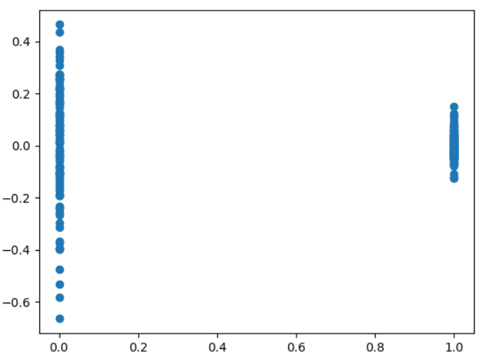
Oh my - the problem does not seem to have gone away. What happened? Well, the “log transform to create homoskedasticity” trick does sometimes works, but it only works in situations where the variance increases as the predictor increases. In this case, the variance decreases as the predictor increases - a log transform makes the problem worse.
Again, this doesn’t mean that a log transform of the dependent variable will never solve your problem. This is, instead, a word of caution on doing so - it may not solve your problem, and there are other solutions worth considering.
Another reason: Because you’d like a model where coefficients combine multiplicatively instead of additively (log-linear model)
An attempt to correct bad OLS assumptions isn’t the only reason we might log transform the response variable. Fitting a model like this will change the way that the coefficients combine in the predicted value of y. This is often done reflexively when the data is positive; Andrew Gelman even recommends trying it any time your data are all-positive.
Let’s consider an example to see how this transformation actually changes the model. Imagine that you’ve recently been spending a lot of time indoors (for some of us this requires very little imagination), time which you’ve spent making extremely detailed tiny sculptures of cats so you can sell them online. This has proven a surprisingly lucrative revenue stream, and you’d like to do an analysis of the customers on your email list. For each customer, you know a few basic facts:
- How much revenue they produced from their purchases last month, in dollars, which we’ll call $y$
- Whether they were a returning customer or a new customer, a binary variable we’ll call $X_{returning}$
- Whether they are in country A or country B (you live in country A, but the denizens of country B seem to absolutely adore cat sculptures), another binary variable, $X_{B}$
You’d like to understand the relationship between the revenue of a customer and their demographic variables. A common model for data like this is something like
\[y = \alpha + \beta_{returning} X_{returning} + \beta_{B} X_{B} + \epsilon\]We can fit this model with OLS, producing $\widehat{\alpha}$, $\widehat{\beta_{returning}}$, and $\widehat{\beta_{B}}$. When we look at this fit, we can inspect these variables and interpret them like this:
- $\widehat{\alpha}$ is the “baseline”, the average revenue for new customers in country A.
- $\widehat{\beta_{returning}}$, and $\widehat{\beta_{B}}$ are the expected added revenue from learning that a customer is returning and that a customer is in country B, respectively. We interpret this as the change in the expected value for each variable, “holding all others constant”.
This model has three coefficient parameters (we’ll avoid talking about the nuisance parameter for noise) and no interaction term. It’s totally plausible that there is an interaction between these two dependent variables. Perhaps returning customers produce more revenue than new ones, and country B customers produce more than country A, and a user who is both produces much more revenue. In that case, the interaction term would be positive, indicating that observing both is correlated with more than either attribute counted individually. It’s also plausible that the interaction term is negative, indicating that there are “diminishing returns”, and the whole is less than the sum of its parts. Either way, adding this kind of interaction to your model will cost you an extra parameter.
Let’s now consider an alternative 3 parameter model:
\[log(y) = \alpha + \beta_{returning} X_{returning} + \beta_{B} X_{B} + \epsilon\]How is this different from the previous model? The parameters now have a different interpretation. For example, $\widehat{\beta_{returning}}$ is no longer the value added to the expected value when we learn a customer is returning. Rather, this now multiplies the expected value by $e^{\widehat{\beta_{returning}}}$. This is sometimes called a log-linear model - the logarithm of y is a linear function of X.
We can see this multiplicative effect a little more clearly by taking the $exp$ of both sides to put $y$ on the original scale:
\[y = e^{\alpha + \beta_{returning} X_{returning} + \beta_{B} X_{B} + \epsilon} = e^{\alpha} e^{\beta_{returning} X_{returning}} e^{\beta_{B} X_{B}} e^\epsilon\]This kind of model makes sense if:
- Your values of $y$ are strictly positive
- It would be convenient to have a model where you can interpret the coefficients as multipliers, rather than additive changes
- You think that the effects of your covariates combine non-additively. Specifically, they combine multiplicatively in the positive direction.
If this last one is true, your model may fit the data better than the additive model with the same number of parameters.
A comparison of the expected value of each subgroup under each model can be found in the table below.
| Customer type | Country | Expected value under additive model | Expected value under log model |
|---|---|---|---|
| New | A | $\alpha$ | $e^{\alpha}$ |
| Returning | A | $\alpha + \beta_{returning}$ | $e^{\alpha} e^{\beta_{returning}}$ |
| New | B | $\alpha + \beta_{B}$ | $e^{\alpha} e^{\beta_{B}}$ |
| Returning | B | $\alpha + \beta_{returning} + \beta_{B}$ | $e^{\alpha} e^{\beta_{returning}} e^{\beta_{B}}$ |
The most important entry here is the last one, demonstrating the non-additive combination of regression terms.
A time series example
Let’s look at another comparison between a linear and log-linear model, this time in the time series domain. We’ll compare the usual additive model to a log-transformed model. To see the difference between these two models in action, we’re going to look at a classic time series dataset of monthly airline passenger counts from 1949 to 1960. This dataset has the number of passengers, $y$, the year $X_{year}$, and the month $X_{january}, \cdots, X_{december}$. We’ll compare the additive model
\[y = \alpha + \beta_{year} X_{year} + \beta_{january} X_{january} + \cdots + \beta_{december} X_{december} + \epsilon\]With the log-linear model
\[log(y) = \alpha + \beta_{year} X_{year} + \beta_{january} X_{january} + \cdots + \beta_{december} X_{december} + \epsilon\]I want to point out that this should not be confused with the classical multiplicative time series decomposition, the log-log model. In that case, we’d need to transform both the response and the covariates. However, the model we construct still does have a multiplicative interpretation as we noted in the previous example.
Plotting the dataset, we see some common features of time series data: there are clear seasonal trends, and a steady increase year over year.
df = pd.read_csv('airline.csv')

df['year'] = df['Month'].apply(lambda x: int(x.split('-')[0]))
df['month_number'] = df['Month'].apply(lambda x: int(x.split('-')[1]))

plt.plot(df['Passengers'])
plt.title('Airline passengers by month')
plt.ylabel('Total passengers')
plt.xlabel('Month')
plt.show()
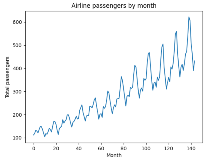
Note that the size of the swings are proportional to the average level of the series - years with a higher average also have larger seasonal swings.
We can fit the two models using statsmodels. We only need to add an np.log to the model specification to fit the log-linear model. We’ll plot their predictions along with the observed data.
additive_model = smf.ols('Passengers ~ year + C(month_number)', df)
additive_fit = additive_model.fit()

log_linear_model = smf.ols('np.log(Passengers) ~ year + C(month_number)', df)
log_linear_model_fit = log_linear_model.fit()

plt.plot(df['Passengers'], label='Observations')
plt.plot(additive_fit.fittedvalues, label='Additive model', linestyle='--')
plt.plot(np.exp(log_linear_model_fit.fittedvalues), label='Log-Linear model', linestyle='--')
plt.legend()
plt.show()
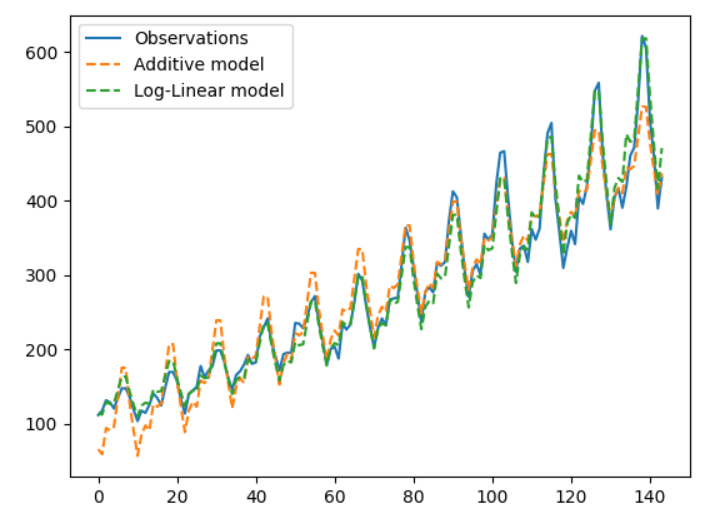
(Note that the LL model outputs on the log scale, so we need to $exp$ the predictions.)
Note that the scale of the additive model doesn’t change as we move from left to right; the additive model predicts monthly fluctuations that are too large in the early part of the data, and too small in the later part of the data.
In addition, let’s see if the residuals look the way we expect with a qqplot:
fig, (ax1, ax2) = plt.subplots(1, 2)
ax1.set_title('Additive model residuals')
ax2.set_title('Log-linear model residuals')
qqplot(additive_fit.resid, line='s', ax=ax1)
qqplot(log_linear_model_fit.resid, line='s', ax=ax2)
plt.show()
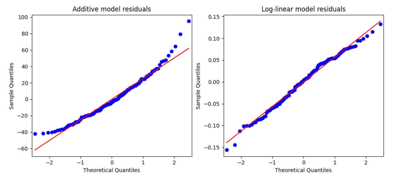
So far, so good - the transformed model residuals do look more normal. (This and this are useful for building intuition about how to interpret QQ plots). But really we’re more interested in the prediction error of the two models. Let’s plot the relative error (residual size as a proportion of the observation) for each monthly observation.
ols_relative_error = np.abs((additive_fit.fittedvalues - df['Passengers'])/df['Passengers'])
lin_log_relative_error = np.abs((np.exp(log_linear_model_fit.fittedvalues) - df['Passengers'])/df['Passengers'])

plt.title('Relative in-sample error')
plt.plot(ols_relative_error, label='OLS model error, Mean= {0:.2f}'.format(np.mean(ols_relative_error)))
plt.plot(lin_log_relative_error, label='Log-transformed model error, Mean={0:.2f}'.format(np.mean(lin_log_relative_error)))
plt.legend()
plt.show()
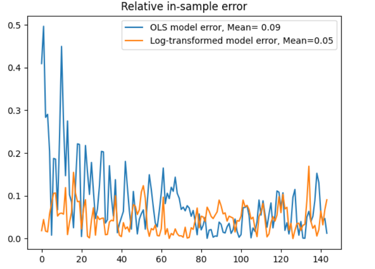
Even though they have the same number of parameters, the log-linear model makes better in-sample predictions in the earlier part of the dataset; the average error is smaller. This is not to say, of course, that this is the one true model of this time series - only that the log-linear model is a better fit, presumably because the yearly and monthly effects combine multiplicatively.
Appendix: Imports
import numpy as np
import pandas as pd
from matplotlib import pyplot as plt
import seaborn as sns
from statsmodels.api import formula as smf
from scipy.stats import norm
from statsmodels.graphics.gofplots import qqplot
Appendix: Further reading
- I found this stackexchange answer to be useful in understanding when a log transform helps us with model assumptions.
- Cosma Shalizi’s excellent regression lecture notes have a good section on log and log-like transforms of the response variable.