Casual Inference Data analysis and other apocrypha
How did my treatment affect the distribution of my outcomes? A/B testing with quantiles and their confidence intervals in Python

We’re familiar with A/B tests that tell us how our metric (usually an average of some kind) changed due to the treatment. But if we want to get a better than average insight into the treatment effect, we should look beyond the mean. This post demonstrates why and how we might look at the way the quantiles of the distribution changed as a result of the treatment, complete with neat visualizations you can show in your next A/B test report built in Python.
Distributional effects of A/B tests are often overlooked but provide a deeper understanding
The group averages and average treatment effect hide a lot of information
Most companies I know of that include A/B testing in their product development process usually do something like the following for most of their tests:
- Pick your favorite metric which you want to increase, and perhaps some other metrics that will act as guard rails. Often, this is some variant of “revenue per user”, “engagment per user”, ROI or the efficiency of the process.
- Design and launch an experiment which compares the existing product’s performance to that of some variant products.
- At some point, decide to stop collecting data.
- Compute the average treatment effect for the control version vs the test variant(s) on each metric. Calculate some measure of uncertainty (like a P-value or confidence/credible interval). Make a decision about whether to replace the existing production product with one of the test variants.
This process is so common because, well, it works - if followed, it will usually result in the introduction of product features which increase our favorite metric. It creates a series of discrete steps in the product space which attempt to optimize the favorite metric without incurring unacceptable losses on the other metrics.
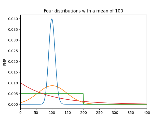
In this process, the average treatment effect is the star of the show. But as we learn in Stats 101, two distributions can look drastically different while still having the same average. For example, here are four remarkably different distributions with the same average:
from matplotlib import pyplot as plt
import seaborn as sns
import numpy as np
from scipy.stats import poisson, skellam, nbinom, randint, geom

for dist in [poisson(100), skellam(1101, 1000), randint(0, 200), geom(1./100)]:
  plt.plot(np.arange(0, 400), dist.pmf(np.arange(0, 400)))
plt.xlim(0, 400)
plt.ylabel('PMF')
plt.title('Four distributions with a mean of 100')
plt.show()
Similarly, the average treatment effect does not tell us much about how our treatment changed the shape of the distribution of outcomes. But we can expand our thinking not just to consider how the treatment changed the average, but the effect on the shape of the distribution; the distributional effect of the treatment. Expanding our thought to think about distributional effects might give us insights that we can’t get from averages alone, and help us see more clearly what our treatment did. For example:
- If we have a positive treatment effect, we can see whether one tail of the distribution was disproportionately affected. Did our gains come from lifting everyone? From squeezing more revenue out of the high-revenue users? From “lifting the floor” on the users who aren’t producing much in control?
- If an experiment negatively affected one tail of the distribution, we can consider mitigation. If our treatment provided a negative experience for users on the low end of the distribution, is there anything we can do to make their experience better?
- Are we meeting our goals for the shape of the distribution? For example, if we want to maintain a minimum service level, are we doing so in the treatment group?
- Do we want to move up market? If so, is our treatment increasing the output for the high end of the outcome distribution?
- Do we want to diversify our customer base? If so, is our treatment increasing our concentration among already high-value users?
The usual average treatment effect cannot answer these questions. We could compare single digit summaries of shape (variance, skewness, kurtosis) between treatment and control. However, even these are only simplified summaries; they describe a single attribute of the shape like the dispersion, symmetry, or heavy tailedness.
Instead, we’ll look at the empirical quantile function of control and treatment, and the difference between them. We’ll lay out some basic definitions here:
- The quantile function is the smooth version of the more familiar percentile distribution. For example, the 0.5 quantile is the median, the value that’s larger than 50% of the mass in the distribution, and the 50th percentile (those are all the same thing).
- The empirical quantile function is the set of quantile values in the treatment/control results which we actually observe.
- The inverse of the quantile function is the CDF , and its empirical counterpart is the empirical CDF. We won’t talk much about the CDF here, but it’s useful to link the two because the CDF is such a common description of a distribution.
Let’s take a look at an example of how we might use these in practice to learn about the distributional effects of a test.
An example: How did my A/B test affect the distribution of revenue?
Let’s once more put ourselves in the shoes of that most beloved of Capitalist Heroes, the purveyor of little tiny cat sunglasses. Having harnessed the illuminating insights of your business’ data, you’ve consistently been improving your key metric of Revenue per Cat. You currently send out a weekly email about the current purrmotional sales, a newsletter beloved by dashing calicos and tabbies the world over. As you are the sort of practical, industrious person who is willing to spend their valuable time reading a blog about statistics, you originally gave this email the very efficient subject line of “Weekly Newsletter” and move on to other things.
However, you’re realizing it’s time to revisit that decision - your previous analysis demonstrated that warm eather is correlated with stronger sales, as cats everywhere flock to sunny patches of light on the rug in the living room. Perhaps, if you could write a suitably eye-catching subject line, you could make the most of this seasonal oppourtunity. Cats are notoriously aloof, so you settle on the overstuffed subject line “Wow so chic ✨ shades 🕶 for cats 😻 summer SALE ☀ buy now” in a desperate bid for their attention. As you are (likely) a person and not a cat, you decide to run an A/B test on this subject line to see if your audience likes the new subject line.
You fire up your A/B testing platform, and get 1000 lucky cats to try the new subject line, and 1000 to try the old one. You measure the revenue purr customer in the period after the test, and you’re ready to analyze the test results.
Lets import some things from the usual suspects:
from scipy.stats import norm, sem # Normal distribution, Standard error of the mean
from copy import deepcopy
import pandas as pd
from tqdm import tqdm # A nice little progress bar
from scipy.stats.mstats import mjci # Calculates the standard error of the quantiles: https://docs.scipy.org/doc/scipy/reference/generated/scipy.stats.mstats.mquantiles_cimj.html
from matplotlib import pyplot as plt # Pretty pictures
import seaborn as sns # Matplotlib's best friend
import numpy as np
In order to get a feel for how revenue differed between treatment and control, let’s start with our usual first tool for understanding distribution shape, the trusty histogram:
plt.title('Distribution of revenue per customer')
sns.distplot(data_control, label='Control')
sns.distplot(data_treatment, label='Treatment')
plt.ylabel('Density')
plt.xlabel('Revenue ($)')
plt.legend()
plt.show()
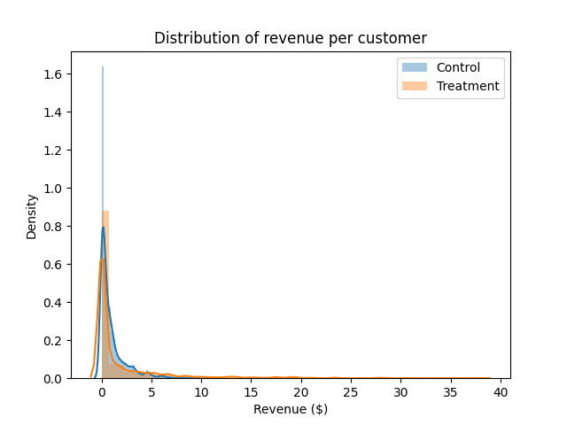
Hm. That’s a little tough to read. Just eyeballing it, the tail on the Treatment group seems a little thicker, but it’s hard to say much more than that.
Let’s see what we can learn about how treatment differs from control. We’ll compute the usual estimate of the average treatment effect on revenue per customer, along with its standard error.
def z_a_over_2(alpha):
  return norm(0, 1).ppf(1.-alpha/2.)

te = np.mean(data_treatment) - np.mean(data_control) # Point estimate of the treatment effect
ci_radius = z_a_over_2(.05) * np.sqrt(sem(data_treatment)**2 + sem(data_control)**2) # Propagate the standard errors of each mean, and compute a CI
print('Average treatment effect: ', te, '+-', ci_radius)
Average treatment effect: 1.1241231969779277 +- 0.29768161367254564
Okay, so it looks like our treatment moved the average revenue per user! That’s good news - it means your carefully chosen subject line will actually translate into better outcomes, all for the low price of a changed subject line.
(An aside: in a test like this, you might pause here to consider other factors. For example: is there evidence that this is a novelty effect, rather than a durable change in the metric? Did I wait long enough to collect my data, to capture downstream events after the email was opened? These are good questions, but we will table them for now.)
It’s certainly good news that the average revenue moved. But, wise statistics sage that you are, you know the average isn’t the whole story. Now, lets think distributionally - let’s consider questions like:
- Is the gain coming from squeezing more out of the big spenders, or increasing engagement with those who spend least?
- Was any part of the distribution negatively affected, even if the gain was positive on average?
We answer these questions by looking at how the distribution shifted.
(Another aside: For this particular problem related to the effects of an email change, we might also look at whether the treatment increased the open rate, or the average order value, or if they went in different directions. This is a useful way to decompose the revenue per customer, but we’ll avoid it in this discussion since it’s pretty email-specific.)
Before we talk about the quantile function, we can also consider another commonly used tool for inspecting distribution shape, which goes by the thematically-appropriate name of box-and-whisker plot.
Q = np.linspace(0.05, .95, 20)

plt.boxplot(data_control, positions=[0], whis=[0, 100])
plt.boxplot(data_treatment, positions=[1], whis=[0, 100])
plt.xticks([0, 1], ['Control', 'Treatment'])
plt.ylabel('Revenue ($)')
plt.title('Box and Whisker - Revenue per customer by Treatment status')
plt.show()
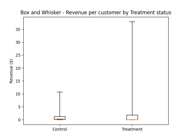
This isn’t especially easy to read either. We can get a couple of things from it: it looks like the max revenue per user in the treatment group was much higher, and the median was lower. (I also tried this one on a log axis, and didn’t find it much easier, but you may find that a more intuitive plot than I did.)
Let’s try a different approach to understanding the distribution shape - we’ll plot the empirical quantile function. We can get this using the np.quantile function, and telling it which quantiles of the data we want to calculate.
plt.title('Quantiles of revenue per customer')
plt.xlabel('Quantile')
plt.ylabel('Revenue ($)')
control_quantiles = np.quantile(data_control, Q)
treatment_quantiles = np.quantile(data_treatment, Q)
plt.plot(Q, control_quantiles, label='Control')
plt.plot(Q, treatment_quantiles, label='Treatment')
plt.legend()
plt.show()
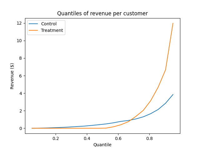
I find this a little easier to understand. Here are some things we can read off from it:
- The 0.5 quantile (the median) of revenue was higher in control than treatment - even though the average treatment user produced more revenue than control!
- Below the 0.75 quantile, it looks like control produced more revenue than treatment. That is, the treatment looks like it may have decreased revenue per customer in about 75% of users (we can’t tell for sure, because there are no confidence intervals on the curves).
- The 0.75 quantile of the two are the same. So 75% of the users in both treatment and control produced less than about $1.
- The big spenders, the top 25% of the distribution produced much more revenue in treatment than control. It appears that the treatment primarily creates an increase in revenue per user by increasing revenue among these highly engaged users.
This is a much more detailed survey of the how the treatment affected our outcome than the average treatment effect can provide. At this point, we might decide to dive a little deeper into what happened with that 75% of users. If we can understand why they were affected negatively by the treatment, perhaps there is something we can do in the next iteration of the test to improve their experience.
Let’s look at this one more way - we’ll look at the treatment effect on the whole quantile curve. That is, we’ll subtract the control curve from the treatment curve, showing us how the treatment changed the shape of the distribution.
plt.title('Quantile difference (Treatment - Control)')
plt.xlabel('Quantile')
plt.ylabel('Treatment - Control')
quantile_diff = treatment_quantiles - control_quantiles
control_se = mjci(data_control, Q)
treatment_se = mjci(data_treatment, Q)
diff_se = np.sqrt(control_se**2 + treatment_se**2)
diff_lower = quantile_diff - z_a_over_2(.05 / len(Q)) * diff_se
diff_upper = quantile_diff + z_a_over_2(.05 / len(Q)) * diff_se
plt.plot(Q, quantile_diff, color='orange')
plt.fill_between(Q, diff_lower, diff_upper, alpha=.5)
plt.axhline(0, linestyle='dashed', color='grey', alpha=.5)
plt.show()
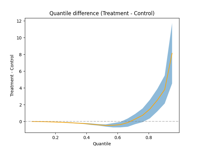
This one includes confidence intervals computed using the Maritz-Jarrett estimator of the quantile standard error. We’ve applied a Bonferroni correction to the estimates as well, so no one accuse us of a poor Familywise Error Rate.
We can read off from this chart where the statistically significant treatment effects on the quantile function are. Namely, the treatment lifted the top 25% of the revenue distribution, and depressed roughly the middle 50%. The mid-revenue users were less interested in the new subject line, but the fat cats in the top 25% of the distribution got even fatter; the entire treatment effect came from high-revenue feline fashionistas buying up all the inventory, so much so that it overshadowed the decrease in the middle.
Some other ways to explore beyond the average treatment effect
The above analysis tells us more than the usual “average” analysis does; it lets us answer questions about how the treatment affects properties of the revenue distribution other than the mean. In a sense, we decomposed the average treatment effect by user quantile. But it’s not the only tool that lets us see how aspects of the distribution changed. There are some other methods we might consider as well:
- Hetereogeneous effect analysis/subgroup analysis: Instead of thinking about how the treatment effect varied by quantile, we can relate it to some set of pre-treatment covariates of interest. By doing so, we can learn how our favorite customer was affected, which might tell us more about the mechanism that makes the treatment work or let us introduce mitigation. This might involve computing interactions between the treatment and subgroups, creating PDPs of the covariates plus treatment indicator, using X-learning or causal forests, to name a few approaches.
- Conditional variance modeling: Instead of looking at the conditional mean, we could instead look at the conditional variance and see whether the variance was increased by the treatment. We could even include other covariates if we desire, letting us build a regression model that predicts the variance rather than the average. An overview of this that I’ve found useful is §10.3 of Cosma Shalizi’s Advanced Data Analysis from an Elementary Point of View.
- Measures of distribution “flatness”: A number of measures tell us something about how evenly distributed a distribution is over its support. We could look at how the treatment affected the Gini coefficent, the entropy, or the kurtosis were affected by the treatment, bootstrapping the standard errors.
- Relating the change in the distribution shape to many variables: Our analysis here related the outcome distribution to one variable: the treatment status. We don’t need to limit ourselves to just just one, though. Similar to the way that regression lets us add more covariates to our “difference of means” analysis, Quantile Regression lets us do this for the quantiles of the distribution. Statsmodels QuantReg is an easy-to-use implementation of this.
Appendix: Where the data in the example came from
Embarassingly, I have not yet achieved the level of free-market enlightment required to run a company that makes money by selling sunglasses to cats. Because of this fact, the data from this example was not actually collected by me, but generated by the following process:
sample_size = 1000
data_control = np.random.normal(0, 1, sample_size)**2
data_treatment = np.concatenate([np.random.normal(0, 0.01, round(sample_size/2)), np.random.normal(0, 2, round(sample_size/2))])**2