Casual Inference Data analysis and other apocrypha
Elasticity and log-log models for practicing data scientists
Models of elasticity and log-log relationships seem to show up over and over in my work. Since I have only a fuzzy, gin-soaked memory of Econ 101, I always have to remind myself of the properties of these models. The commonly used $y = \alpha x ^\beta$ version of this model ends up being pretty easy to interpret, and has wide applicabilty across many domains that actual data scientists work.
It’s everywhere!
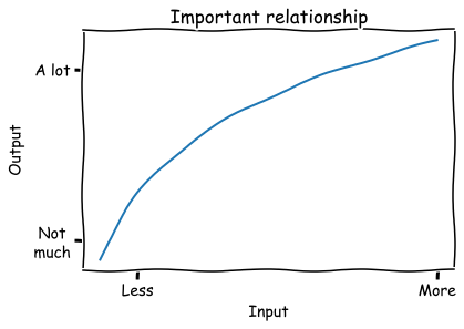
I have spent a shocking percentage of my career drawing some version of this diagram on a whiteboard:

This relationship has a few key aspects that I notice over and over again:
- The output increases when more input is added; the line slopes up.
- Each input added is less efficient than the last; the slope is decreasing.
- Inputs and outputs are both positive
There’s also a downward-sloping variant, and a lot of the same analysis goes into that as well.
If you’re an economist, or even if you just took econ 101, you likely recognize this. It’s common to model this kind of relationship as $y = ax^b$, a function which has “constant elasticity”, meaning an percent change in input produces the same percent change in output regardless of where you are in the input space. A common example is the Cobb-Douglas production function. The most common examples all seem to be related to price, such as how changes in price affect the amount demanded or supplied.
Lots and lots and lots of measured variables seem to have this relationship. In my own career I’ve seen this shape of input-output relationship show up over and over, even outside the price examples:
- Marketing spend and impressions
- Number of users who see something vs the number who engage with it
- Number of samples vs model quality
- Time spent on a project and quality of result
- Size of an investment vs revenue generated (this one was popularized and explored by a well known early data scientist)
To get some intuition, lets look at some examples of how different values of $\alpha$ and $\beta$ affect the shape of this function:
x = np.linspace(.1, 3)

def f(x, a, b):
  return a*x**b

plt.title('Examples of ax^b')
plt.plot(x, f(x, 1, 0.5), label='a=1,b=0.5')
plt.plot(x, f(x, 1, 1.5), label='a=1,b=1.5')
plt.plot(x, f(x, 1, 1.0), label='a=1,b=1.0')
plt.plot(x, f(x, 3, 0.5), label='a=2,b=0.5')
plt.plot(x, f(x, 3, 1.5), label='a=2,b=1.5')
plt.plot(x, f(x, 3, 1.0), label='a=2,b=1.0')
plt.legend()
plt.show()
By and large, we see that $\alpha$ and $\beta$ are the analogues of the intercept and slope, that is
- $\alpha$ affects the vertical scale, or where the curve is anchored when $x=0$
- $\beta$ affects the curvature (when $\beta < 1$, there are diminishing returns; when $\beta > 1$ increasing returns, when $\beta = 0$ then it’s linear). When it’s negative, the slope is downward.
Nonetheless, I am not an economist (though I’ve had the pleasure of working with plenty of brilliant people with economics training). If you’re like me, then you might not have these details close to hand. This post is meant to be a small primer for anyone who needs to build models with these kinds of functions.
We usually want to know this relationship so we can answer some practical questions such as:
- How much input will we need to add in order to reach our desired level of output?
- If we have some free capital, material, or time to spend, what will we get for it? Should we use it here or somewhere else?
- When will it become inefficient to add more input, ie when will the value of the marginal input be less than the marginal output?
Let’s look at the $ \alpha x ^\beta$ model in detail.
Some useful facts about the $y = \alpha x ^\beta$ model
It makes it easy to talk about % change in input vs % change in output
One of the many reasons that the common OLS model $y = \alpha + \beta x$ is so popular is that it lets us make a very succinct statement about the relationship between $x$ and $y$: “A one-unit increase in $x$ is associated with an increase of $\beta$ units of $y$.” What’s the equivalent to this for our model $y = \alpha x ^ \beta$?
The interpretation of this model is a little different than the usual OLS model. Instead, we’ll ask: how does multiplying the input multiply the output? That is, how do percent changes in $x$ produce percent changes in $y$? For example, we might wonder what happens when we increase the input by 10%, ie multiplying it by 1.1. Lets see how multiplying the input by $m$ creates a multiplier on the output:
$\frac{f(xm)}{f(x)} = \frac{\alpha (xm)^\beta}{\alpha x ^ \beta} = m^\beta$
That means for this model, we can summarize changes between variables as:
Under this model, multiplying the input by m multiplies the output by $m^\beta$.
Or, if you are percentage afficionado:
Under this model, changing the input by $p\%$ changes the output output by $(1+p\%)^\beta$.
It’s easy to fit with OLS
Another reason that the OLS model is so popular is because it is easy to estimate in practice. The OLS model may not always be true, but it is often easy to estimate it, and it might tell us something interesting even if it isn’t correct. Some basic algebra lets us turn our model into one we can fit with OLS. Starting with our model:
$y = \alpha x^\beta$
Taking the logarithm of both sides:
$log \ y = log \ \alpha + \beta \ log \ x$
This model is linear in $log \ x$, so we can now use OLS to calculate the coefficients! Just don’t forget to $exp$ the intercept to get $\alpha$ on the right scale.
We can use it to solve for input if we know the desired level of output
In practical settings, we often start with the desired quantity of output, and then try to understand if the required input is available or feasible. It’s handy to have a closed form which inverts our model:
$f^{-1}(y) = (y/\alpha)^{\frac{1}{\beta}}$
If we want to know how a change in the output will require change in the input, we look at how multiplying the output by $m$ changes the required value of $x$:
$\frac{f^{-1}(ym)}{f^{-1}(y)} = m^{\frac{1}{\beta}}$
That means if our goal is to multiply the output by $m$ we need to multiply the input by $m^{\frac{1}{\beta}}$.
An example: Lotsize vs house price
Let’s look at how this relationship might be estimated on a real data set. Here, we’ll use a data set of house prices along with the size of the lot they sit on. The question of how lot size relates to house price has a bunch of the features we expect, namely:
- The slope is positive - all other things equal, we’d expect bigger lots to sell for more.
- Each input added is less efficient than the last; adding more to an already large lot probably doesn’t change the price much.
- Lot-size and price are both positive.
Lets grab the data:
from matplotlib import pyplot as plt
import seaborn as sns
import numpy as np
import pandas as pd
from statsmodels.api import formula as smf

df = pd.read_csv('https://vincentarelbundock.github.io/Rdatasets/csv/AER/HousePrices.csv')
df = df.sort_values('lotsize')
We’ll fit our log-log model and plot it:
model = smf.ols('np.log(price) ~ np.log(lotsize)', df).fit()

plt.scatter(df['lotsize'], df['price'])
plt.plot(df['lotsize'], np.exp(model.fittedvalues), color='orange', label='Log-log model')
plt.title('Lot Size vs House Price')
plt.xlabel('Lot Size')
plt.ylabel('House Price')
plt.legend()
plt.tight_layout()
plt.show()
Okay, looks good so far. This seems like a plausible model for this case. Let’s double check it by looking at it on the log scale:
plt.scatter(df['lotsize'], df['price'])
plt.plot(df['lotsize'], np.exp(model.fittedvalues), label='Log-log model', color='orange')
plt.xscale('log')
plt.yscale('log')
plt.title('LogLot Size vs Log House Price')
plt.xlabel('Log Lot Size')
plt.ylabel('Log House Price')
plt.legend()
plt.tight_layout()
plt.show()
Nice. When we log-ify everything, it looks like a textbook regression example.
Okay, let’s interpret this model. Lets convert the point estimate of $\beta$ into an estimate of percent change:
b = model.params['np.log(lotsize)']
a = np.exp(model.params['Intercept'])
print('1% increase in lotsize -->', round(100*(1.01**b-1), 2), '% increase in price')
print('2% increase in lotsize -->', round(100*(1.02**b-1), 2), '% increase in price')
print('10% increase in lotsize -->', round(100*(1.10**b-1), 2), '% increase in price')
1% increase in lotsize --> 0.54 % increase in price
2% increase in lotsize --> 1.08 % increase in price
10% increase in lotsize --> 5.3 % increase in price
We see that relatively, price increases more slowly than lotsize.
Does this model really describe reality? A reminder that a convenient model need not be the correct model
The above set of tips and tricks is, when you get down to it, mostly algebra. It’s useful algebra to be sure, but it is really just repeated manipulation of the functional form $\alpha x ^ \beta$. It turns out that that functional form is both a priori plausible for lots of relationships, and is easy to work with.
However, we should not mistake analytical convenience for truth. We should recognize that assuming a particular functional form comes with risks, so we should spend some time:
- Demonstrating that this functional form is a good fit for the data at hand by doing regression diagnostics like residual plots
- Understanding how far off our model’s predictions and prediction intervals are from the truth by doing cross-validation
- Making sure we’re clear on what causal assumptions we’re making, if we’re going to consider counterfactuals
This is always good practice, of course - but it’s easy to forget about it once you have a particular model that is convenient to work with.
Some alternatives to the model we’ve been using
As I mentioned above, the log-log model isn’t the only game in town.
For one, we’ve assumed that the “true” function should have constant elasticity. But that need not be true; we could imagine taking some other function and computing its point elasticity in one spot, or its arc elasticity between two points.
What about alternatives to $y = \alpha x^\beta$ and the log-log model?
- If you just want a model that is non-decreasing or non-increasing, you could try non-parametric isotonic regression.
- You could pick a different transformation other than log, like a square root. This also works when there are zeros, whereas $log(0)$ is undefined.
- Another possible transformation is Inverse Hyperbolic Sine, which also has an elasticity interpreation.
Appendix: Estimating when you have only two data points
Occasionally I’ve gone and computed an observed elasticity by fitting the model from a single pair of observations. This isn’t often all that useful, but I’ve included it here in case you find it helpful.
Lets imagine we have only two data points, which we’ll call $x_1, y_1, x_2, y_2$. Then, we have two equations and two unknowns, that is:
\[y_1 = \alpha x_1^\beta\] \[y_2 = \alpha x_2^\beta\]If we do some algebra, we can come up with estimates for each variable:
\[\beta = \frac{log \ y_1 - log \ y_2}{log \ x_1 - log \ x_2}\] \[\alpha = exp(log \ y_1 + \beta \ log \ x_1)\]import numpy as np
def solve(x1, x2, y1, y2):
# y1 = a*x1**b
# y2 = a*x2**b
log_x1, log_x2, log_y1, log_y2 = np.log(x1), np.log(x2), np.log(y1), np.log(y2)
b = (log_y1 - log_y2) / (log_x1 - log_x2)
log_a = log_y1 + b*log_x1
return np.exp(log_a), b
Then, we can run an example like this one in which a 1% increase in $x$ leads to a 50% increase in $y$:
a, b = solve(1, 1.01, 1, 1.5)
print(a, b, 1.01**b)
Which shows us a=1.0, b=40.74890715609402, 1.01^b=1.5.