Casual Inference Data analysis and other apocrypha
Partial dependence plots are a simple way to make black-box models easy to understand

A commonly cited drawback of black-box Machine Learning or nonparametric models is that they’re hard to interpret. Sometimes, analysts are even willing to use a model that fits the data poorly because the model is easy to interpret. However, we can often produce clear interpretations of complex models by constructing Partial Dependence Plots. These plots are model-agnostic, easy to implement in Python, and have a natural interpretation even for non-experts. They’re awesome tools, and you should use them all the time to understand the relationships you’re modeling, even when the model that best fits the data is really complex.
If we want to understand complex relationships, we need complex models
We frequently model the relationships between a set of variables and an outcome of interest by building a model. This might be so we can make predictions about unseen outcomes, or so we can build a theory of how the variables affect the outcome, or simply to describe the observed relationships between the variables. Whatever our goal, we collect a bunch of examples, then infer a model that relates the inputs to the outcome.
A data analyst with access to R or Python has a ton of powerful modeling tools at their disposal. With a single line of scikit-learn, they can often produce a model with a substantial predictive power. The last 70 or so years of machine learning and nonparametric modeling research allows us to produce models that make good predictions without much explicit feature engineering, which automatically find interactions or nonlinearities, and so on. A common workflow is to consider a set of models which are a priori plausible, and select the best model (or the best few) using a procedure based on cross validation. You might simply pick the model with the best out-of-sample error, or perhaps one that is both parsimonious and makes good predictions. The result: after you’ve done all this sklearning and grid searching and gradient descending and whatever else, you’ve got a model that accurately predicts your data. Because of all this fancy business, the resulting model might be complex - it might be a random forest with a thousand trees, or an boosted collection of learners, or a neural network with a bunch of hidden layers.
But black-box models can make it hard to understand the effect of a single feature
In many real-world situations, we can use all these fancy libraries to find a black-box model that fits our data well. However, we often want more than just a model that makes good predictions. We frequently want to use our models to expand our intuition about the relationships between variables. And more than that, most consumers of a model are skeptical, intelligent people, who want to understand how the model works before they’re willing to trust it. We may even want to use our model to understand how to build interventions or causal relationships.
What if the model that best fits your data is a complex black-box model, but you also want to do some intuition-building? If you fit a simple model which fits the data badly, you’ll have a poor approximation with high interpretability. If you fit a black-box model which approximates the relationship well out of sample, you may find yourself unable to understand how your model works, and build any useful intuitive knowledge.
I’ve met a number of smart, skilled analysts who at this point will throw up their hands and just fit a model that they know is not very good, but has a clear interpretation. This is understandable, since an approximate solution is better than no solution - but it’s not necessary, as it turns out even black-box models are still interpretable if we think about it the right way. We’ll look at a specific example of this, and walk through how to do it in Python.
An example: The relationship between air quality and housing prices
We’ll introduce a short example here which we’ll revisit from a few perspectives. This example involves a straightforward question and small data set, but relationships between variables that are non-linear and possible interactions. The data is the classic Boston Housing dataset, available in sklearn. This data originally came from an investigation of the relationship between air quality, as measured by nitric oxide (“NOX”) concentration, and median house price. The data includes measurements from a number of Boston neighborhoods in the 1970s, and includes their measured NOX, median house price, and other variables indicating factors that might affect house price (like the business and demographic makeup of the area). We’ll ask the research question: What is the relationship between NOX and house price? We’ll break that down into two further questions:
- All else being equal, do changes in NOX correlate with changes in house price in this data set?
- Could we say that NOX causes changes in median house price?
Note that these are two different questions! The first one is about correlation, and we can answer it just with the data at hand. The second one is a much more tricky question, and we won’t answer it definitively here; however, we’ll talk about what we would need to convincingly answer that question. We’ll mostly focus on the first question, but we’ll talk about the second in our last section.
Let’s write a bit of code to grab the data and start down the road to answering these questions. We’ll begin by importing a bunch of things:
from sklearn.datasets import load_boston
import pandas as pd
from sklearn.model_selection import cross_val_score
from sklearn.linear_model import LinearRegression
from sklearn.ensemble import RandomForestRegressor
from matplotlib import pyplot as plt
import seaborn as sns
import statsmodels.api as sm
from sklearn.inspection import partial_dependence
from sklearn.utils import resample
from scipy.stats import sem
import numpy as np
from statsmodels.graphics.regressionplots import plot_partregress
We load the data from sklearn:
boston_data = load_boston()
X = pd.DataFrame(boston_data['data'], columns=boston_data['feature_names'])
y = boston_data['target']
If we knew the true relationship between all the X variables and the y variable, we could answer our questions above. Of course, we don’t know the true relationship, so we’ll attempt to infer it (as best we can) from the data we’ve collected. That is, we’ll build a model that relates neighborhood attributes (X) to home price (y) and try to answer our question with that model.
Let’s look at a few candidate models, a Linear Regression and a Random Forest:
mse_linear_model = -cross_val_score(LinearRegression(), X, y, cv=100, scoring='neg_root_mean_squared_error')
mse_rf_model = -cross_val_score(RandomForestRegressor(n_estimators=100), X, y, cv=100, scoring='neg_root_mean_squared_error')
mse_reduction = mse_rf_model - mse_linear_model

print('Average MSE for linear regression is {0:.3f}'.format(np.mean(mse_linear_model)))
print('Average MSE for random forest is {0:.3f}'.format(np.mean(mse_rf_model)))
print('Switching to a Random Forest over a linear regression reduces MSE on average by {0:.3f} ± {1:.3f}'.format(np.mean(mse_reduction), 3*sem(mse_reduction)))
Output:
Average MSE for linear regression is 4.184
Average MSE for random forest is 3.024
Switching to a Random Forest over a linear regression reduces MSE on average by -1.160 ± 0.514
We see that the Random Forest model produces better predictive power than the Linear Regression when we look at the out-of-sample RMSE. So far, so good! Perhaps if we dug a little deeper, we’d find a better model - for now, let’s assume we’re only considering these two. Already, we know something valuable! That is that the random forest does a better job of predicting home prices for neighborhoods it hasn’t seen than the linear model does.
Option 1: Make a scatter plot and ignore the other variables
Let’s step back for a moment. Usually, when we are confronted with a “does this variable correlate with that variable” question, we start with a scatterplot. Why not simply make a scatterplot of NOX against median house value? Well, there’s nothing stopping us from doing this, so let’s do it:
sns.regplot(X['NOX'], y, lowess=True)
plt.ylabel('Median house price')
plt.xlabel('NOX')
plt.title('Scatter plot of NOX vs price with LOWESS fit')
plt.show()
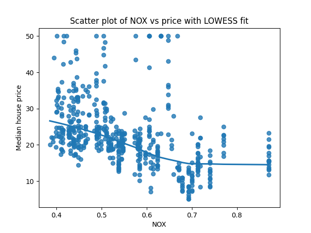
This is a perfectly good start, and often worth doing. This does tell us something useful, which is that NOX is negatively correlated with house prices. That is, areas with higher NOX (and thus worse air quality) have a lower house price, on average. We’ve also plotted the LOWESS fit, giving us some idea of how the average price changes as we look at neighborhoods with different NOX.
So…are we done? All that huffing and puffing so we can answer our question with a scatterplot? NOX is negatively correlated with house price - done.
Option 2: Build a simple model with a clear interpretation, like a linear model
Not quite. There’s a straightforward objection to this finding, which is that our scatterplot ignores the other variables we know about. We can think of the last section as a very simple model in which NOX is the sole variable that affects house prices, but we know this was an oversimplification. That is, NOX might just be higher in neighborhoods that are undesirable for other reasons, and NOX has nothing to do with it. If this kind of coincidence were really the case, we wouldn’t see it in the scatterplot above. We want the unique impact of NOX - that’s the “holding all else constant” part of our question above. We can expand our model to be more realistic by including the other variables that we believe affect home prices, hoping to avoid omitted variable bias.
We saw before that a simple linear regression isn’t the best model, but perhaps it’s good enough for us to learn something from. We’ll fit a linear model and look at its summary:
sm.OLS(y, X).fit().summary()
This produces the very official-looking regression results:
                                 OLS Regression Results
=======================================================================================
Dep. Variable:                      y   R-squared (uncentered):                   0.959
Model:                            OLS   Adj. R-squared (uncentered):              0.958
Method:                 Least Squares   F-statistic:                              891.3
Date:                Mon, 23 Nov 2020   Prob (F-statistic):                        0.00
Time:                        14:12:20   Log-Likelihood:                         -1523.8
No. Observations:                 506   AIC:                                      3074.
Df Residuals:                     493   BIC:                                      3128.
Df Model:                          13
Covariance Type:            nonrobust
==============================================================================
                 coef    std err          t      P>|t|      [0.025      0.975]
------------------------------------------------------------------------------
CRIM          -0.0929      0.034     -2.699      0.007      -0.161      -0.025
ZN             0.0487      0.014      3.382      0.001       0.020       0.077
INDUS         -0.0041      0.064     -0.063      0.950      -0.131       0.123
CHAS           2.8540      0.904      3.157      0.002       1.078       4.630
NOX           -2.8684      3.359     -0.854      0.394      -9.468       3.731
RM             5.9281      0.309     19.178      0.000       5.321       6.535
AGE           -0.0073      0.014     -0.526      0.599      -0.034       0.020
DIS           -0.9685      0.196     -4.951      0.000      -1.353      -0.584
RAD            0.1712      0.067      2.564      0.011       0.040       0.302
TAX           -0.0094      0.004     -2.395      0.017      -0.017      -0.002
PTRATIO       -0.3922      0.110     -3.570      0.000      -0.608      -0.176
B              0.0149      0.003      5.528      0.000       0.010       0.020
LSTAT         -0.4163      0.051     -8.197      0.000      -0.516      -0.317
==============================================================================
Omnibus:                      204.082   Durbin-Watson:                   0.999
Prob(Omnibus):                  0.000   Jarque-Bera (JB):             1374.225
Skew:                           1.609   Prob(JB):                    3.90e-299
Kurtosis:                      10.404   Cond. No.                     8.50e+03
==============================================================================
With respect to our research question, this tells us:
- In the linear model, when all else is held constant, an increase in NOX is associated with a decrease in house price.
- The coefficient is not significant, and the confidence interval spans (-9.468, 3.731).
We can visualize this relationship with a partial regression plot, which is easy if we just call plot_partregress:
plot_partregress(y, X['NOX'], X.drop('NOX', axis=1), obs_labels=False)
plt.axhline(0, linestyle='dotted')
plt.ylim(-2, 2)
plt.show()
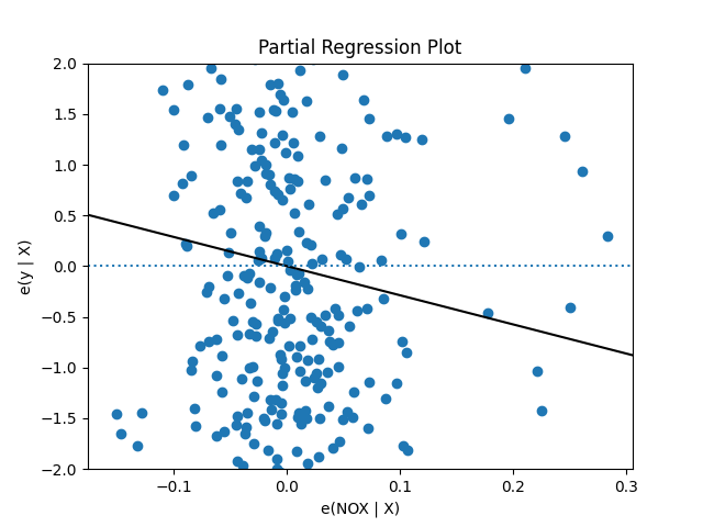
This is a visual representation of the negative regression coefficienct we saw before - it says that when we hold all the other variables constant, positive changes in NOX are associated with negative change in house price. Note that the X and Y axes are centered at zero, so X = 0 is the average NOX.
Regression is a powerful tool for understanding the unique relationship between many variables and an outcome - there’s a reason it’s one of the most-used tools in your toolkit. However, we made some assumptions along the way. We’ll interrogate one of those assumptions, which is that the outcome varies linearly with each covariate. We’ll check that using a popular regression diagnostic, a plot of covariate vs residuals:
sns.regplot(X['NOX'],
            sm.OLS(y, X).fit().resid,
            lowess=True,
            scatter_kws={'alpha': .1})
plt.axhline(0, linestyle='dotted')
plt.title('Residual diagnostic')
plt.xlabel('NOX')
plt.ylabel('Predicted - actual')
plt.ylim(-5, 5)
plt.show()
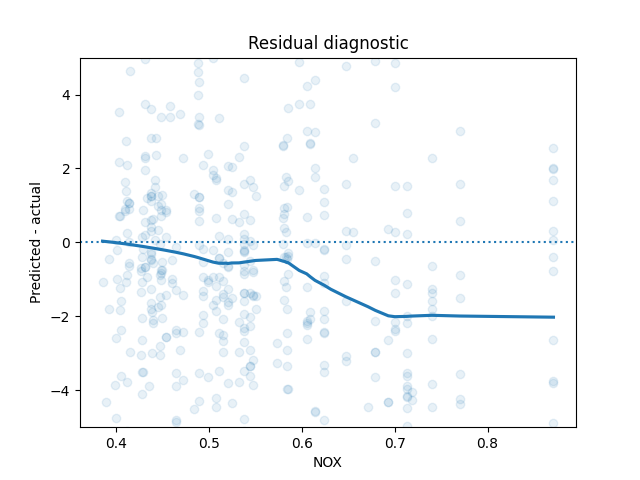
We don’t see what we want to see - residuals uncorrelated with the covariate. This is an indication that one of our modeling assumptions was likely violated.
If we want to stay in the world of linear models, we might do a few different things:
- We might expand our model to consider nonlinear and interaction terms, to try and account for the non-linear relationship.
- We might do some transformation of the input or output variables, to see if massaging things a little allows us to make the usual regression assumptions safely.
- We might just hit the brakes and end our analysis - we include the above plot in our report, with an asterisk that the relationship isn’t exactly linear but we have a linear approximation to it.
However, this is a little unsatisfying - why already have a model that is a better fit to the data, why can’t we just use that?
Option 3: Build a more complex model and use a partial dependence plot
The relationship we care about doesn’t seem to quite fit the assumptions of a linear model. And we know that we have a better model in hand according to out-of-sample error, the random forest model. How can we use that to answer our question?
The problem is that while the linear model has a single number encoding the way that a feature affects the model prediction - the coefficient for NOX - the random forest doesn’t have any clear analogue. In a random forest, a large number of decision trees are combined and averaged, resulting in a process with a lot of moving parts. We could consult the feature_importances_ attribute of the Random Forest, which will tell us if a feature is important, but it won’t actually give us the relationship (for example, it includes no sign).
Let’s return to our question again and see what we can do. Roughly, we’d like to know: “what happens to price when NOX changes but all other variables are held constant?”. Well, we have a model, which in theory tells us what the expected price will be if we tell it a neighborhood’s attributes. We’ll try changing NOX and leaving the other variables, and asking the model what happens to the price. Specifically, we’ll run the following algorithm:
- Copy the dataset, and set all the NOX to some value, not touching any of the other variables.
- Predict the home prices for each neighborhood of the modified data set using our model.
- Calculate the average over all the predictions.
- Repeat for all the values of NOX we’d be interested in.
This simple algorithm is exactly the partial dependence plot. Let’s run it for a bunch of values over the span of NOX:
rf_model = RandomForestRegressor(n_estimators=100).fit(X, y)

nox_values = np.linspace(np.min(X['NOX']), np.max(X['NOX']))

pdp_values = []
for n in nox_values:
  X_pdp = X.copy()
  X_pdp['NOX'] = n
  pdp_values.append(np.mean(rf_model.predict(X_pdp)))

plt.plot(nox_values, pdp_values)
plt.ylabel('Predicted house price')
plt.xlabel('NOX')
plt.title('Partial dependence plot for NOX vs Price for Random Forest')
plt.show()
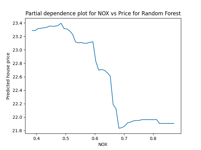
This curve has a pretty clear interpretation: If we were to set every neighborhood’s NOX to a particular value, the predicted average price across all neighborhoods is given by the PDP curve. It’s worth noting that here we see a non-linear relationship between NOX and price, with a similar shape to the regression diagnostic plot above.
The PDP method has a lot of advantages. It’s easy to code, easy to understand, and it doesn’t care what model we are using. It does have a downside, which is that for complex models and large samples, it doesn’t scale especially well - in order to generate one point on the PDP curve, we need to make a prediction for all of the data points we have.
I’ve mostly skipped the math in this explanation, because others have covered it better than I could. Nonetheless, I’ll note here that the PDP is telling us $\hat{\mathbb{E}}[price \mid NOX=x]$, where the hat indicates that we’re marginalizing over all the non-NOX variables using the observed values, and the random forest is approximating conditional expectation. If you want a more formal exposition than the intuitive idea I’ve presented here, see the references at the end, particularly Christoph Molnar’s book chapter.
Confidence intervals for PDPs with bootstrapping
One thing that’s a little unsatisfying about the PDP is that it’s only a point estimate. With the linear model, we were able to get a standard error that tells us how seriously we should take the coefficient we saw. We could do all sorts of useful things to summarize our uncertainty around the coefficient, like computing confidence intervals and P-values. It would be nice to have a similar measure of uncertainty around the PDP curve.
The model-agnostic quality of the PDP makes it hard to reason about the samping distribution/standard errors. In order to get around this we’ll use another famous model-agnostic method, bootstrap standard errors (section 1.3). We’ll run a bootstrap and compute the standard error at each point on the PDP curve. This isn’t quite a drop-in replacement for “is this variable significant or not”, but maybe that’s fine - the usual significant test of a single variable glosses over a lot of detail, and there’s no obvious non-linear analogue. We could still ask more pointed questions, like “does the PDP curve differ significantly between values $x_1$ and $x_2$”, if we like.
Let’s run the bootstrap PDP for 100 bootstrap simulations:
n_bootstrap = 100

nox_values = np.linspace(np.min(X['NOX']), np.max(X['NOX']))

expected_value_bootstrap_replications = []

for _ in range(n_bootstrap):
    X_boot, y_boot = resample(X, y)
    rf_model_boot = RandomForestRegressor(n_estimators=100).fit(X_boot, y_boot)

    bootstrap_model_predictions = []
    for n in nox_values:
        X_pdp = X_boot.copy()
        X_pdp['NOX'] = n
        bootstrap_model_predictions.append(np.mean(rf_model.predict(X_pdp)))
    expected_value_bootstrap_replications.append(bootstrap_model_predictions)

expected_value_bootstrap_replications = np.array(expected_value_bootstrap_replications)
for ev in expected_value_bootstrap_replications:
    plt.plot(nox_values, ev, color='blue', alpha=.1)

prediction_se = np.std(expected_value_bootstrap_replications, axis=0)

plt.plot(nox_values, pdp_values, label='Model predictions')
plt.fill_between(nox_values, pdp_values - 3*prediction_se, pdp_values + 3*prediction_se, alpha=.5, label='Bootstrap CI')
plt.legend()
plt.ylabel('Median house price')
plt.xlabel('NOX')
plt.title('Partial dependence plot for NOX vs Price for Random Forest')
plt.show()
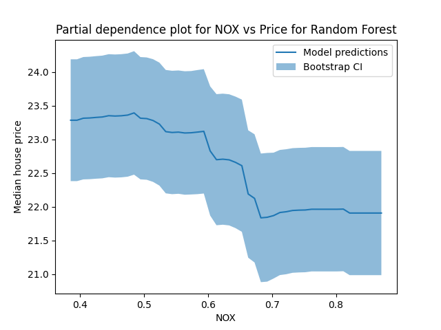
Ta-da! We see that there’s a good amount of uncertainty here. Maybe that’s not so surprising - we only have a few hundred data points, and we’re estimating a pretty complex model.
When does the PDP represent a causal relationship?
This section uses a bit of language from causal inference, particularly the idea of a “back door path”. Most of this content is from Causal interpretations of black-box models, Zhao et al 2018, which is well worth a read if you want to know more. That paper even uses the same Boston housing data set, making it a natural on-ramp after you read this post.
It’s very tempting to interpret the PDP as a prediction about what would happen if we changed the global NOX to some amount. In causal inference terms, that would be an intervention, in which we actually shift the NOX and see what happens to prices. In this interpretation, our model is a method of simulating what would happen if we changed NOX, and we treat its predictions as counterfactual scenarios. Is this interpretation justified?
It is if we make certain assumptions - but they’re strong assumptions, and we’re probably not in a position to make them. It’s worth walking through those assumptions, to understand what kind of argument we’d need to make in order to interpret the PDP causally.
One set of assumptions that would let us interpret the PDP causally is if we simply assumed that there were no confounders. This would happen in a setting like a randomized control trial, in which we randomize which units get treated, and so there can be no “common cause” between the treatment (like NOX) and the outcome (like median home price). This assumption is very clearly unreasonable in this setting. We know that the data was collected in a non-experimental setting, and beside that the experiment required (namely, manipulating air quality and seeing what happens to house prices) is not especially practical.
That leaves us in the world of causal inference from observational data. We’ll avoid discussions of methods like IV here, and focus on conditioning on all the confounders in order to identify the causal relationship. In classical causal inference, we often condition on all the variables that block the back-door paths between the treatment and outcome in order to identify the causal effect of the treatment. Commonly, analysts use methods like linear regression here to condition on the confounders, and then interpret the regression coefficient for the treatment causally.
In order to interpret the PDP causally in our case, we need to make two assumptions:
- NOX is not a cause of any other predictor variables. This corresponds to the usual injunction not to control for post-treatment variables.
- The other predictor variables block all back-door paths between NOX and house price. This is a much stronger assumption, and it’s much less clear that it is safe to assume to.
If we make these assumptions, then Zhao et. al demonstrate that we can interpret the PDP causally (see §3.2 of the paper). This is because of the remarkable fact that the PDP’s formal definition is the same as Pearl’s backdoor adjustment.
In this section I talked a lot about “assumptions” and “arguments”. You might wonder why I did so - why can’t I just tell you what analysis you need to run, so you can see if the assumptions are justified? This is because we cannot demonstrate from the data that confounding exists - there is no statistical test for confounding (see also this SE answer). As a result, if you want to interpret your PDP causally, you’ll need to make some assumptions. Whether they’re strong assumptions or not depends on your level of domain knowledge and the problem you’re solving - unfortunately, there’s no easy way out here.
A bonus: It’s easy to use PDPs to examine the relationship between multiple inputs and the output
So far we’ve look at the effect of NOX on price, but we might just as well be interested in the same analysis for more than one variable. In this section, we’ll look at the effect of both nitric oxide concentration and whether the home has a view of the Charles river (denoted by CHAS in the data). For this example, one covariate is continuous and one is binary. We can amend our research question a little bit, to ask: “As NOX and CHAS change together, what happens to house price?”.
First, let’s look at the distribution of NOX for both CHAS=0 and CHAS=1 neighborhoods. Specifically, we’d like to see if NOX is way different for one group vs the other. For example, it would be hard to make any inference at all if NOX were only high when CHAS=0 and only low when CHAS=1.
sns.distplot(X[X['CHAS'] == 0]['NOX'], label='CHAS=0')
sns.distplot(X[X['CHAS'] == 1]['NOX'], label='CHAS=1')
plt.title('Distribution of NOX for each value of CHAS')
plt.legend()
plt.show()
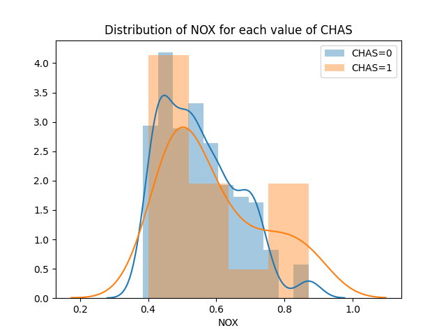
Looking at this, we see NOX varies across its range for both values of CHAS.
Let’s run our PDP again. In this case, our PDP algorithm is slightly different from before:
- Copy the dataset, and set all the NOX and CHAS to some value, not touching any of the other variables.
- Predict the home prices for each neighborhood of the modified data set using our model.
- Calculate the average over all the predictions.
- Repeat for all the values of NOX and CHAS we’d be interested in.
We can do this with a bit of shameless copy-pasting from our original code, giving us two PDP curves since CHAS is discrete:
rf_model = RandomForestRegressor(n_estimators=100).fit(X, y)

nox_values = np.linspace(np.min(X['NOX']), np.max(X['NOX']))
chas_values = [0, 1]

pdp_values = []
for n in nox_values:
  X_pdp = X.copy()
  X_pdp['CHAS'] = 0
  X_pdp['NOX'] = n
  pdp_values.append(np.mean(rf_model.predict(X_pdp)))
plt.plot(nox_values, pdp_values, label='CHAS=0')

pdp_values = []
for n in nox_values:
  X_pdp = X.copy()
  X_pdp['CHAS'] = 1
  X_pdp['NOX'] = n
  pdp_values.append(np.mean(rf_model.predict(X_pdp)))
plt.plot(nox_values, pdp_values, label='CHAS=1')

plt.legend()

plt.xlabel('NOX')
plt.title('Partial dependence plot for NOX and CHAS vs Price for Random Forest')
plt.show()
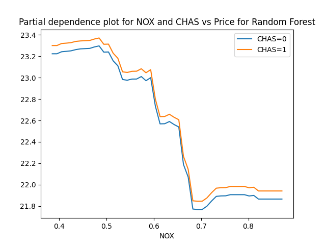
Roughly speaking, the model predicts home value as if CHAS is additive with NOX. That is, for any given value of NOX, it looks like going from CHAS=0 to CHAS=1 adds a small constant value to the median home price. However, if we want to think about this causally, we’ll want to reconsider the assumptions we made before - it’s possible that we can interpret the PDP of NOX causally, but the same assumptions are not reasonable for this PDP.
This example gives rise to two separate PDP curves because CHAS is discrete - you either have a view of the river or you don’t, in this data. If we had two continuous variables, we might make a heat map over the range of the two variables; some thoughts about that are included in the appendix.
Some further reading
- Christoph Molnar’s excellent book on interpretable machine learning
- Sklearn’s Partial Dependency plot generating tools
- Causal interpretations of black-box models, Zhao et al 2018
- An alternative to bootstrapping to get Random Forest CIs, Confidence Intervals for Random Forests: The Jackknife and the Infinitesimal Jackknife, Waget et al 2014
Appendix: Some more thoughts on PDPs multivariate relationships
Our earlier example involved a single binary and a single continuous variable. However, it’s entirely possible to use it to understand the relationship between the outcome and two continuous inputs. When we do so, we’ll want to be a little careful. Since the PDP is so powerful, letting us predict the outcome for any set of inputs, we might accidentally simulate unlikely or impossible relationships. This short section is a sketch of how we might think of using PDPs thoughtfully for two continuous inputs.
- First, generate a scatterplot or seaborn jointplot to understand how the variables change together. Specifically, we’d like to understand if there is a strong correlation between them, and how they co-occur.
- Usually, there is only a subset of each variables’ support where the two occur together. For two Gaussian variables, there might be a circular or oval region where they occur together. Inside this area, we would be interpolating; outside it we are extrapolating. -We can characterize the interpolation region by computing the convex hull using scipy’s interface to qhull.
- To avoid extrapolation, we then only compute the PDP inside the convex hull. For some thoughts about how to do that in Python, see this SE answer. -Finally, create a heatmap or isocline inside the convex hull representing the PDP, giving us the PDP across the interpolation region.