Casual Inference Data analysis and other apocrypha
What customer group drove the change in my favorite metric? Exact decompositions of change over time
As analytics professionals, we frequently summarize the state of the business with metrics that measure some aspect of its performance. We check these metrics every day, week, or month, and try to understand what changed them. Often we inspect a few familiar subgroups (maybe your customer regions, or demographics) to understand how much each group contributed to the change. This pattern is so common and so useful that it’s worth noting some general-purpose decompositions that we can use when we come across this problem. This initial perspective can give us the intuition to plan a deeper statistical or causal analysis.
Are my sales growing? Which customers are driving it?
A KPI (or metric) is a single-number snapshot of the business that summarizes something we care about. Data Scientists design and track metrics regularly in order to understand how the business is doing - if it’s achieving its goals, where it needs to allocate more resources, and whether anything surprising is happening. When these metrics move (whether that move is positive or negative), we usually want to understand why that happened, so we than think about what (if anything) needs to be done about it. A common tactic for doing this is to think about the different segments that make up your base of customers, and how each one contributed to the way your KPI changed.
A prototypical example is something like a retail store, whose operators make money by selling things to their customers. In order to take a practical look at how metrics might inform our understanding of the business situation, we’ll look at data from a UK-based online retailer which tracks their total sales and total customers over time for the countries they operate in. As an online retailer, you produce value by selling stuff; you can measure the total volume of stuff you sold by looking at total revenue, and your efficiency by looking at the revenue produced per customer. This kind of retailer might make marketing, product, sales or inventory decisions at the country level, so it would be useful to understand how each country contributed to your sales growth and value growth.
Where did my revenue come from
As a retailer, one reasonable way to measure your business’ success is by looking at your total revenue over time. We’ll refer to the total revenue in month $t$ as $R_t$. The total revenue is the revenue across each country we operate in, so
\[R_t = r_t^{UK} + r_t^{Germany} + r_t^{Australia} + r_t^{France} + r_t^{Other} = \sum\limits_g r_t^g\]We’ll use this kind of notation throughout - the superscript (like $g$) indicates the group of customers, the subscript (like $t$) indicates the time period. Our groups will be countries, and our time periods will be months of the year 2011.
We can plot $R_t$ to see how our revenue evolved over time.
total_rev_df = monthly_df.groupby('date').sum()

plt.plot(total_rev_df.index, total_rev_df['revenue'] / 1e6, marker='o')
plt.title('Monthly revenue')
plt.xlabel('Month')
plt.ylabel('Total Revenue, millions')
plt.show()
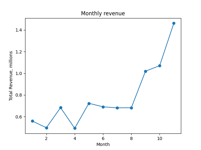
A plot of the revenue over time, $ R_t.$
Presumably, if some revenue is good, more must be better; we want to know the revenue growth each month. The revenue growth is just this month minus last month:
\[\Delta R_t = R_t - R_{t-1}\]When $\Delta R_t > 0$, things are getting better. Just like revenue $R_t$, we can plot growth $\Delta R_t$ each month:
plt.plot(total_rev_df.index[1:], np.diff(total_rev_df['revenue'] / 1e6), marker='o')
plt.title('Monthly revenue change')
plt.xlabel('Month')
plt.ylabel('Month-over-month revenue change, millions')
plt.axhline(0, linestyle='dotted')
plt.show()
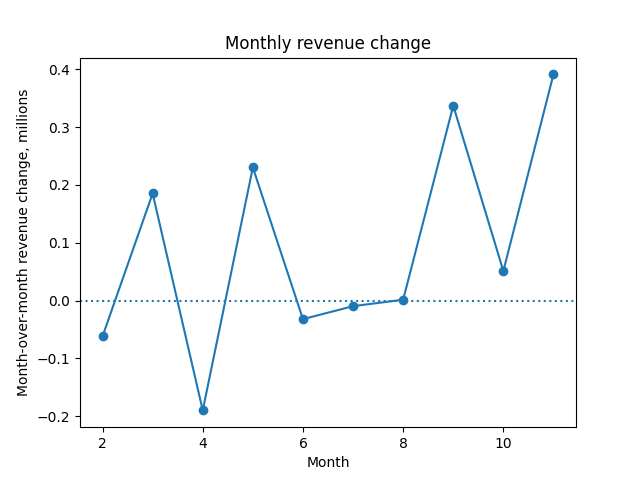
A plot of the month-over-month change in revenue, $\Delta R_t.$
So far, we’ve tracked revenue and revenue growth. But we haven’t made any statements about which customers groups saw the most growth. We can get a better understanding of which customer groups changed their behavior, increasing or decreasing their spending, by decomposing $\Delta R_t$ by customer group:
\[\Delta R_t = \underbrace{r_t^{UK} - r_{t-1}^{UK}}_\textrm{UK revenue growth} + \underbrace{r_t^{Germany} - r_{t-1}^{Germany}}_\textrm{Germany revenue growth} + \underbrace{r_t^{Australia} - r_{t-1}^{Australia}}_\textrm{Australia revenue growth} + \underbrace{r_t^{France} - r_{t-1}^{France}}_\textrm{France revenue growth} + \underbrace{r_t^{Other} - r_{t-1}^{Other}}_\textrm{Other country revenue growth}\]Or a little more compactly:
\[\Delta R_t = \sum\limits_g (r_t^g - r_{t-1}^g) = \sum\limits_g \Delta R^g_t\]We can write a quick python function to perform this decomposition:
def decompose_total_rev(df):
  dates, date_dfs = zip(*[(t, t_df.sort_values('country_coarse').reset_index()) for t, t_df in df.groupby('date', sort=True)])
  first = date_dfs[0]
  groups = first['country_coarse']
  columns = ['total'] + list(groups)
  result_rows = np.empty((len(dates), len(groups)+1))
  result_rows[0][0] = first['revenue'].sum()
  result_rows[0][1:] = np.nan
  for t in range(1, len(result_rows)):
    result_rows[t][0] = date_dfs[t]['revenue'].sum()
    result_rows[t][1:] = date_dfs[t]['revenue'] - date_dfs[t-1]['revenue']
  result_df = pd.DataFrame(result_rows, columns=columns)
  result_df['date'] = dates
  return result_df
And then plot the country-level contributions to change:
ALL_COUNTRIES = ['United Kingdom', 'Germany', 'France', 'Australia', 'All others']

total_revenue_factors_df = decompose_total_rev(monthly_df)

plt.title('Monthly revenue change, by country')
plt.xlabel('Month')
plt.ylabel('Month-over-month revenue change, millions')

for c in ALL_COUNTRIES:
  plt.plot(total_revenue_factors_df['date'], total_revenue_factors_df[c], label=c)
plt.legend()
plt.show()
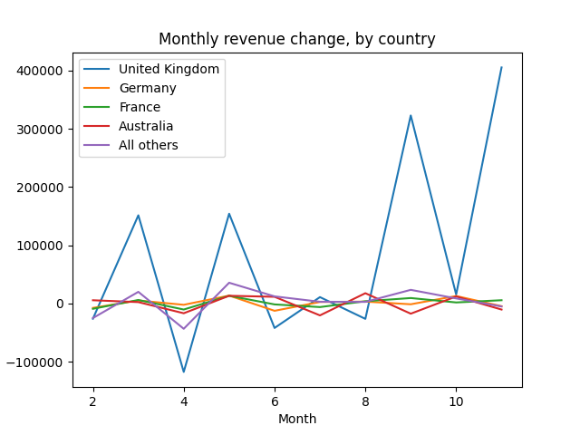
A plot of the change in revenue by country, $\Delta R_t^g.$
As we might expect for a UK-based retailer, the UK is almost always the main driver of the revenue change. The revenue metric is is mostly measure what happens in the UK, since customers there supply an outsize amount (5x or 10x, depending on the month) of their revenue.
We might also plot a scaled version, $\Delta R_t^g / \Delta R_t$, normalizing by the total size of each month’s change.
Why did my value per customer change
We commonly decompose revenue into
\[\text{Revenue} = \underbrace{\frac{\text{Revenue}}{\text{Customer}}}_\textrm{Value of a customer} \times \text{Total customers}\]We do this because the things that affect the first term might be different from those that affect the second. For example, further down-funnel changes to our product might affect the value of a customer, but not produce any new customers. As a result, the value per customer is a useful KPI on its own.
We’ll define the value of a customer in month $t$ as the total revenue over all regions divided by the customer count over all regions.
$V_t = \frac{\sum\limits_g r^g_t}{\sum\limits_g c^g_t}$
We can plot the value of the average customer over time:
value_per_customer_series = monthly_df.groupby('date').sum()['revenue'] / monthly_df.groupby('date').sum()['n_customers']
plt.title('Average Value per customer')
plt.ylabel('Value, $')
plt.xlabel('Month')
plt.plot(value_per_customer_series.index, value_per_customer_series)
plt.show()
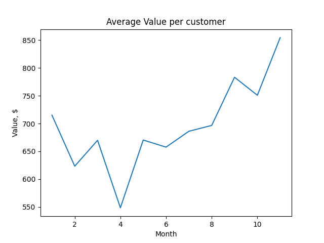
A plot of the customer value over time, $V_t$.
As with revenue, we often want to look at the change in customer value from one month to the next:
$\Delta V_t = V_t - V_{t-1}$
value_per_customer_series = monthly_df.groupby('date').sum()['revenue'] / monthly_df.groupby('date').sum()['n_customers']
plt.title('Monthly Change in Average Value per customer')
plt.ylabel('Value, $')
plt.xlabel('Month')
plt.plot(value_per_customer_series.index[1:], np.diff(value_per_customer_series), marker='o')
plt.axhline(0, linestyle='dotted')
plt.show()
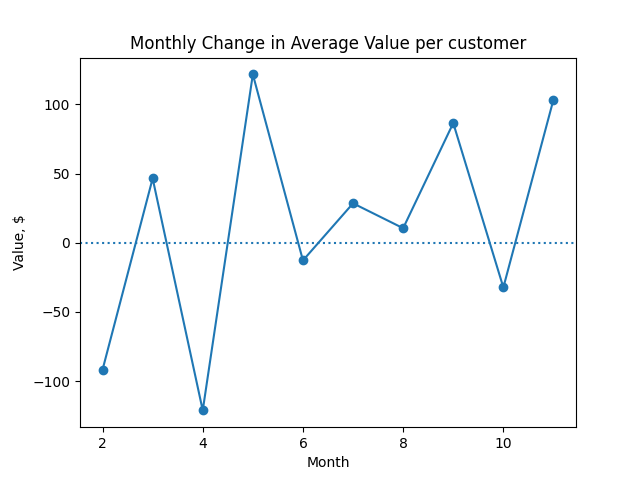
A plot of the month-over-month change in customer value, $\Delta V_t$.
By grouping and calculating $V_t$, we could get the value of a customer in each region:
$V^g_t = \frac{r^g_t}{c^g_t}$
We want to look a little deeper into how country-level changes roll up into the overall change in value that we see.
Why did our customer value change?
There are two ways to increase the value of our customers:
- We can change the mix of our customers so that more of them come from more valuable countries. For example, we might market to customers in a particularly lucrative country.
- We can increase the value of the customers in a specific country. For example, we might try to understand what new features will appeal to customers in a particular country.
Both of these are potential sources of change in any given month. How much of this month’s change in value was because the mix of customers changed? How much was due to within-country factors? A clever decomposition from this note by Daniel Corro allows us to get a perspective on this.
The value growth decomposition given by Corro is:
$\Delta V_t = \alpha_t + \beta_t = \sum\limits_g (\alpha_t^g + \beta_t^g)$
Where we have defined the total number of customers at time $t$ across all countries:
$C_t = \sum\limits_g c_t^g$
In this decomposition there are two main components, $\alpha_t$ and $\beta_t$. $\alpha_t$ is the mix component, which tells us how much of the change was due to the mix of customers changing across countries. $\beta_t$ is the matched difference component, which tells us how much of the change was due to within-country factors.
The mix component is:
$\alpha_t = \sum\limits_g \alpha_t^g = \sum\limits_g V_{t-1}^g (\frac{c_t^g}{C_t} - \frac{c_{t-1}^g}{C_{t-1}})$
The idea here is that $\alpha_t$ is the change that we get when we apply the new mix without changing the value per country.
The matched difference component is:
$\beta_t = \sum\limits_g \beta_t^g = \sum\limits_g (V_t^g - V_{t-1}^g) (\frac{c_t^g}{C_t})$
$\beta_t$ is the change we would get if we updated the country-level values to what we see at time $t$, but keep the mix the same.
If we’re less interested in the mix vs matched difference distinction, and more interested in a country-level perspective, we can collapse the two to show contribution by country:
$\Delta V_t = \sum\limits_g \Delta V_t^g$
Where we’re defined the country-level contribution:
$\Delta V_t^g = \alpha^g_t + \beta^g_t = V_t^g \frac{c_t^g}{C_t} - V_{t-1}^g \frac{c_{t-1}^g}{C_{t-1}}$
Okay, let’s see that in code. We can write a python function to perform the decomposition for us, and give us back a dataframe that indicates each contributor to the change over time:
def decompose_value_per_customer(df):
  dates, date_dfs = zip(*[(t, t_df.sort_values('country_coarse').reset_index()) for t, t_df in df.groupby('date', sort=True)])
  first = date_dfs[0]
  groups = first['country_coarse']
  columns = ['value', 'a', 'b'] + ['{0}_a'.format(g) for g in groups] + ['{0}_b'.format(g) for g in groups]
  result_rows = np.empty((len(dates), len(columns)))
  cust_t = pd.Series([dt_df['n_customers'].sum() for dt_df in date_dfs])
  rev_t = pd.Series([dt_df['revenue'].sum() for dt_df in date_dfs])
  value_t = rev_t / cust_t
  result_rows[:,0] = value_t
  result_rows[0][1:] = np.nan
  for t in range(1, len(result_rows)):
    cust_t_g = date_dfs[t]['n_customers']
    rev_t_g = date_dfs[t]['revenue']
    value_t_g  = rev_t_g / cust_t_g
    cust_t_previous_g = date_dfs[t-1]['n_customers']
    rev_t_previous_g = date_dfs[t-1]['revenue']
    value_t_previous_g  = rev_t_previous_g / cust_t_previous_g
    a_t_g = value_t_previous_g * ((cust_t_g / cust_t[t]) - (cust_t_previous_g / cust_t[t-1]))
    b_t_g = (value_t_g - value_t_previous_g) * (cust_t_g / cust_t[t])
    result_rows[t][3:3+len(groups)] = a_t_g
    result_rows[t][3+len(groups):] = b_t_g
    result_rows[t][1] = np.sum(a_t_g)
    result_rows[t][2] = np.sum(b_t_g)
  result_df = pd.DataFrame(result_rows, columns=columns)
  result_df['dates'] = dates
  return result_df
Then we can use it to plot the contributions of the mix component vs the matched difference component to the monthly change:
customer_value_breakdown_df = decompose_value_per_customer(monthly_df)

plt.title('Breaking down monthly changes')
plt.xlabel('Month')
plt.ylabel('Change in customer value, $')

plt.plot(customer_value_breakdown_df.dates.iloc[1:],
         customer_value_breakdown_df['a'].iloc[1:], marker='o', label='Mix')
plt.plot(customer_value_breakdown_df.dates.iloc[1:],
         customer_value_breakdown_df['b'].iloc[1:], marker='o', label='Matched difference')
plt.legend()
plt.axhline(0, linestyle='dotted')
plt.show()
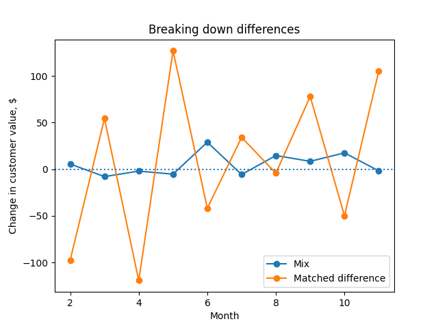
A plot of the mix and matched-difference components of Corro's decomposition, $\alpha_t$ and $\beta_t$.
We see that the main driver of changing customer value is within-country factors, rather than changes in the customer mix.
Since this fluctuates a lot, it can be helpful to plot the scaled versions of each, $\frac{\alpha_t}{\alpha_t + \beta_t}$ and $\frac{\beta_t}{\alpha_t + \beta_t}$
plt.title('Breaking down monthly changes, scaled')
plt.xlabel('Month')
plt.ylabel('Scaled Change in customer value, $')

plt.plot(customer_value_breakdown_df.dates.iloc[1:],
         customer_value_breakdown_df['a'].iloc[1:] / np.diff(customer_value_breakdown_df['value']), marker='o', label='Mix')
plt.plot(customer_value_breakdown_df.dates.iloc[1:],
         customer_value_breakdown_df['b'].iloc[1:] / np.diff(customer_value_breakdown_df['value']), marker='o', label='Matched difference')
plt.axhline(0, linestyle='dotted')
plt.legend()
plt.show()
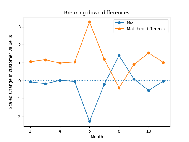
A plot of the scaled mix and matched difference components of change, $\frac{\alpha_t}{\alpha_t + \beta_t}$ and $\frac{\beta_t}{\alpha_t + \beta_t}$.
We see that August is the only month in which the mix was the more important component. In that month, it looks like the value of each country didn’t change, but our mix across countries did.
Lastly, we can plot the country level contribution, scaled in a similar way:
plt.title('Breaking down monthly changes by country, scaled')
plt.xlabel('Month')
plt.ylabel('Scaled Change in customer value, $')

for c in ALL_COUNTRIES:
  plt.plot(customer_value_breakdown_df['dates'].iloc[1:],
           (customer_value_breakdown_df[c+'_a'].iloc[1:] + customer_value_breakdown_df[c+'_b'].iloc[1:]),
           label=c)
plt.legend()
plt.show()

# Australia contributed disproportionately positively in August, because Australians became more valuable customers in August
# Correlations between country contributions?
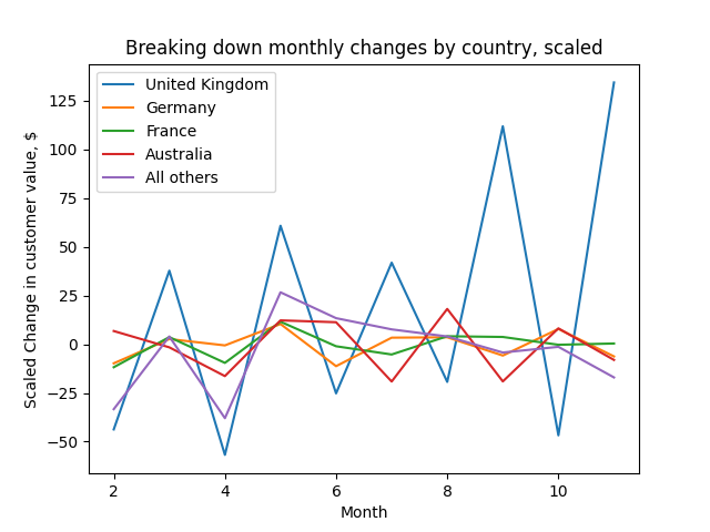
A plot of each country's contribution to the change in customer value each month, $\Delta V_t^g$.
As with change in revenue, the UK is the biggest contributor to the change in customer value.
Quantifying uncertainty
At this point, we’ve got some exact decompositions which we can use to understand which subgroups contributed the most to the change in our favorite metric. However, we might ask whether the change we saw was statistically significant - or perhaps more usefully, we might try to quantify the uncertainty around the $\alpha_t$ or $\beta_t$ that we estimated.
Corro suggests (p 6) paired weighted T-tests for based on the observed value of each group. These test the hypotheses $\alpha_t = 0$ and $\beta_t = 0$. These probably wouldn’t be hard to implement using weightstats.ttost_paired in statsmodels.
Appendix: Notation reference
| Symbol | Definition |
|---|---|
| $g$ | Subgroup index |
| $t$ | Discrete time step index |
| $r_t^g$ | Revenue at time $t$ for group $g$ |
| $R_t$ | Total revenue at time $t$ summed over all groups |
| $\Delta R_t$ | Month-to-month change in revenue, $R_t - R_{t-1}$ |
| $c_t^g$ | Number of customers at time $t$ in group $g$ |
| $C_t$ | Number of customers at time $t$ summed over all groups |
| $V_t$ | Customer value; revenue per customer at time $t$ |
| $\Delta V_t$ | Month-to-month change in value at time $t$, $V_t - V_{t-1}$ |
| $\alpha_t^g$ | Mix component of $\Delta V_t$ for group $g$ |
| $\beta_t^g$ | Matched difference component of $\Delta V_t$ for group $g$ |
| $\alpha_t$ | Mix component of $\Delta V_t$ summed over all groups |
| $\beta_t$ | Matched difference component of $\Delta V_t$ summed over all groups |
| $\Delta V_t^g$ | Contribution of group $g$ to $\Delta V_t$ |
Appendix: Import statements and data cleaning
curl https://archive.ics.uci.edu/ml/machine-learning-databases/00352/Online%20Retail.xlsx --output online_retail.xlsx
import pandas as pd
import numpy as np
from matplotlib import pyplot as plt
import seaborn as sns

retail_df = pd.read_excel('online_retail.xlsx')

begin = pd.to_datetime('2011-01-01 00:00:00', yearfirst=True)
end = pd.to_datetime('2011-12-01 00:00:00', yearfirst=True)

retail_df = retail_df[(retail_df['InvoiceDate'] > begin) & (retail_df['InvoiceDate'] < end)]

COUNTRIES = {'United Kingdom', 'France', 'Australia', 'Germany'}

retail_df['country_coarse'] = retail_df['Country'].apply(lambda x: x if x in COUNTRIES else 'All others')
retail_df['date'] = retail_df['InvoiceDate'].apply(lambda x: x.month)
retail_df['revenue'] = retail_df['Quantity'] * retail_df['UnitPrice']
# Add number of customers in this country

monthly_gb = retail_df[['date', 'country_coarse', 'revenue', 'CustomerID']].groupby(['date', 'country_coarse'])
monthly_df  = pd.DataFrame(monthly_gb['revenue'].sum())
monthly_df['n_customers'] = monthly_gb['CustomerID'].nunique()
monthly_df = monthly_df.reset_index()